styling the writing and creations post lists
~ 1 minute to read
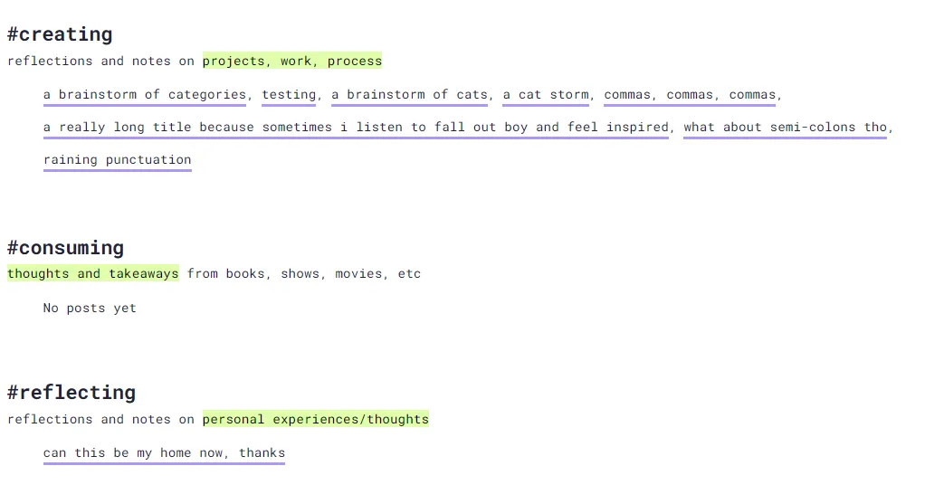
I wasn't feeling the list view on the writing. and creations/ pages, so I changed them to be more horizontal. I like that I can show more posts this way, without forcing someone to scroll forever. Hmm, will probably eventually want to address mobile (maybe only show 5 posts and add a link to a filtered archive page?).
I'm not sure how I feel about hiding the dates. It was cleaner to get rid of them, and the when feels secondary to the what, but idk, I might revisit this later and try to add them back in.
Also, I don't have enough posts to see it in action on those two pages yet, so this screenshot was taken by copy pasting lis in the dev tools Elements tab.
the css
I added creations-links and writing-links as a class_name to the pages. So these styles won't affect the main blog list page.
.creations-links main,
.writing-links main {
	max-width: unset;
}

/* lets the list items go horizontal and wrap to the next line */
.creations-links ul.blog-posts,
.writing-links ul.blog-posts  {
	display: flex;
  	flex-wrap: wrap;
}

/* adds space after each post title */
.creations-links ul.blog-posts li,
.writing-links ul.blog-posts li {
	margin-right: .5rem;
}

/* adds the comma after each post title */
.creations-links ul.blog-posts li:after,
.writing-links ul.blog-posts li:after {
	content: ", ";
}

/* removes the comma if the post title is the last one in the list */
.creations-links ul.blog-posts li:last-child:after,
.writing-links ul.blog-posts li:last-child:after {
	content: "";
}
- Written: 12 May, 2025
- Published:
- Last updated: 10 months, 3 weeks ago